
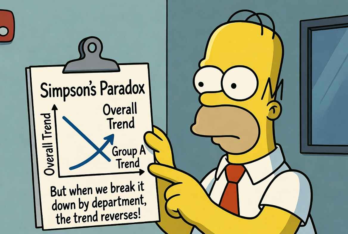
Simpson's Paradox on the Shop Floor: Segment Before You Decide
Same data, opposite conclusions. The roll-up blames Night; the segments show Night ahead. How Simpson's Paradox leads industrial engineers to make wrong conclusions.
It’s Monday, and you stare at a neat set of bars rolling up last week’s performance. The roll‑up says “Night underperformed,” and you’re about to draft some action items and a coaching plan. It feels decisive because the picture is clean, but it’s also wrong.
The floor doesn’t make one kind of unit one kind of way: it makes easy builds and hard builds, it runs on fixtures that behave differently as they warm up, and it rotates operators of different skill levels. This leads to Simpson’s paradox for factories: the aggregate trend flips when you split the data along the dimensions that govern difficulty, equipment, or skill.
Plants that ignore it waste coaching on the wrong crews, escalate with the wrong suppliers, and approve the wrong capital. The fix is simple: segment before you decide.
What Actually Happened Last Week
The line missed the weekly target, overtime is already tight, and your inbox has a slide that rolls up the last 2,000 units by shift with a red box around Night. You have to tell the ops lead whether to coach the crew, add another inspection, or change the sequence. Here’s what the roll‑up shows:
Aggregate (what the dashboard shows)
| Shift | Units | Good | FPY |
|---|---|---|---|
| Day | 1,000 | 930 | 93.0% |
| Night | 1,000 | 819 | 81.9% |
If you stop here, you fall for Simpson’s paradox. If you split by build difficulty, a new pattern emerges:
Within segments (what actually happened)
| Segment | Day FPY | Night FPY | Day Volume | Night Volume |
|---|---|---|---|---|
| Easy builds | 95.0% | 99.0% | 900 | 100 |
| Hard builds | 75.0% | 80.0% | 100 | 900 |
Within each segment, Night outperformed Day; it’s just that Night did most of the hard mix. If you reweight to a common mix, the illusion goes away:
Mix‑adjusted view (reweighting)
| Scenario | FPY |
|---|---|
| Actual Day | 93.0% |
| Actual Night | 81.9% |
| Day with Night’s mix | 77.0% |
| Night with Day’s mix | 97.1% |
The confounder (here, mix difficulty) influences who gets what work and how that work performs. Looking only at the roll‑ups gives a false impression; you need to segment to see the work as it happened. Looking at the segments can shift the conversation from “why are you worse?” to “what made this segment hard, and how do we balance it?”
Simpson’s Paradox Revealed
Toggle between views. The aggregate says Night underperforms. The segments say Night outperforms in both categories. Same data, opposite conclusions.
Fixtures Hide Inside Aggregates
Cycle times can have the same trap. Team A looks slow in the roll‑up. But before you intervene, ask a fundamental question: “Did the teams run the same assets under the same conditions?” They didn’t. The busiest asset in the area, Fixture 12, runs a little fast when cold and adds dwell as it warms. The blended average hides this behavior and makes Team A look like the problem because they ran most of the volume on 12.
Aggregate cycle time comparison
| Team | Cycles | Avg CT (s) |
|---|---|---|
| A | 1,200 | 31.0 |
| B | 1,100 | 29.5 |
Cycle time by fixture
| Fixture | Team A CT (s) | Team B CT (s) | Team A Vol | Team B Vol |
|---|---|---|---|---|
| Fixture 12 (warms up, drifts) | 32.0 | 34.0 | 900 | 200 |
| Fixture 7 (stable) | 28.0 | 28.5 | 300 | 900 |
Within fixtures, the story flips. On both fixtures, Team A is faster. The fix shifts from blaming Team A to introducing cool‑downs after changeovers, pulling the heaviest options off the first hour after lunch, and scheduling a quick maintenance task tied to the drift. The average improves because the asset does, not because the team is told to “own the number.”
Suppliers Aren’t Always the Story Your Roll-Up Tells
Quality escalations are the most expensive place to let the roll‑up drive the narrative. Line B flags a supplier lot (Q17), and the weekly report shows a clean gap against Line A. The next step on the escalation checklist is usually a vendor call. Before you make it, split the rows by who actually ran the work.
Supplier lot FPY comparison
| Supplier Lot | Line A FPY | Line B FPY |
|---|---|---|
| Lot Q17 | 91.5% | 96.0% |
FPY by operator experience
| Operator Band | Line A FPY | Line B FPY | Line A Units | Line B Units |
|---|---|---|---|---|
| A‑band (experienced) | 97.8% | 97.5% | 300 | 120 |
| B‑band (new) | 88.9% | 95.7% | 700 | 480 |
If most of Line A’s units on Q17 were run by newer operators while Line B put A‑band on the same lot, read the within‑band numbers as a staffing signal, not a supplier defect. Drop the escalation. Instead, review the exact inspection step that failed, standardize a quick in‑station check to remove the common misread, and pair B‑band with a mentor on that SKU for a week. The FPY gap should close without a vendor call.
The Discipline That Prevents Bad Decisions
Factories juggle descriptive and causal questions. “What happened?” is descriptive. “Why did it happen and what should we do?” is causal. Simpson’s paradox shows up when you answer the causal question with a descriptive roll‑up.
Here is a simple 6-step guide on avoiding this mistake:
- Write the exact decision in one line (e.g., “Coach Night or not?” “Fix Fixture 12 first?” “Escalate lot Q17?”).
- List what changes difficulty or assignment (mix, fixture/asset ID, operator band, time of day).
- Compare apples to apples: segment by those factors and compare inside each segment.
- Put both sides on the same mix and compare again (reweight to a common mix).
- If segments and the roll‑up disagree, trust the segments.
- Act on the cause you found (training, fixture control, staffing, sequence).
How to Reweight (Step 4)
Variable definitions
| Variable | Description |
|---|---|
| First-pass yield for easy builds | |
| First-pass yield for hard builds | |
| Number of easy build units | |
| Number of hard build units | |
| Total units (1,000 in our example) |
The aggregate yield for any shift is the weighted average across segments:
To compute the counterfactual “What would Day’s FPY be if it had Night’s mix?”, use Night’s volume weights with Day’s segment performance:
For the example from Table 2:
- Day on easy: 95%, Night on easy: 99%
- Day on hard: 75%, Night on hard: 80%
- Night’s mix: 100 easy, 900 hard (out of 1,000)
Day with Night’s mix =
Night with Day’s mix =
This reveals Night outperforms Day at every mix ratio, even though the raw aggregate (81.9% vs 93.0%) says the opposite.
Only after the segment view is clear do you show the aggregate for context. Matching interventions to actual root causes shows up fast: less overtime chasing noise, fewer expedites, and calmer ramps because fixes land on the right fixtures, training, and sequence.
How Material Model Enables Segment‑First Analysis
Segment‑first only works when the raw observations are detailed enough to explain why one slice runs differently from another. Collecting this data is tedious and time‑intensive. This is where Material Model comes in. We help transform your work videos, no matter how they’re recorded, into elemental timelines: worksteps, MODAPTS motions, or machine states like clamp, transfer, and dwell. With those timelines, you can see differences in the work itself: extra reaches on one shift that don’t appear on the other, a longer “align” element on a specific fixture after lunch, a quality check that sometimes lands inside the cycle and sometimes floats outside. Those are the differences that justify segmenting, and they are the levers you can actually pull.
If you want to see the gaps on your own line, record a few clips from a manufacturing station in question, run them through Material Model at app.materialmodel.com, and compare the elemental timelines side by side.
Related Articles

When KPIs Go Wrong: Goodhart's Law for Industrial Engineers
KPIs that boil down to “just do it faster” create rework, hidden factories, and fake wins on dashboards. But there is a better way that can help align everyone from operator to supervisor with what the factory actually needs.

Don’t Undermeasure: How Cheap Annotation Changes the Tempo of Decision-Making
When measurement is expensive, planning becomes unreliable; automating time‑study annotation lowers the cost of fresh data so that every decision can be grounded in facts.

Better Inputs, Better Factories: What We Learned About Measuring Work
Industrial engineers spend 4-14 hours weekly recording GoPro videos, writing MODAPTS codes, and hunting for missing minutes in their routings. Here is what we learned from IEs at Tesla, GM, and dozens of other manufacturers about how time studies actually get done.